The number of mobile device users are growing rapidly that most businesses are starting to make their websites more mobile-friendly. By doing this, they increase their online presence and help potential clients find information easily regardless if they are using a tablet or a smartphone.
However, making your website mobile friendly is not just about changing the layout. It is about optimizing the whole mobile experience to improve your conversions and overall performance. You will get more clients in any location at any time. We enumerated some simple tips that you can do to make your site more mobile friendly.
- Think of your audience when making your site mobile friendly.
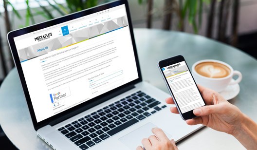
For instance, choose a website setup that will make browsing easier for your audience. We recommend a mobile responsive web design where the site adapts to the type of mobile device used. To learn what design works best, you must understand what your audience wants.
To test your design for mobile friendliness, you can try effective tools such as Google Usability Test or Chrome Developer. This way, you will have a better idea on how your website looks like on various mobile devices.
- Fix your keywords.
Mobile users use different keywords compared to desktop users. The latter are always in a hurry and just type what comes to their mind—which are mostly short phrases. So, you have to research what words they use in searching information. You can do a research on those keywords and input them on your site to increase its visibility.
- Write quality and short content.
Most mobile device users find and read information fast, so it’s possible they won’t read a very long article about a beauty product or a spa service. We advise that you create content that is informative and straight to the point, yet customer-focused and engaging.
In addition, you should know that spaces in mobile devices are limited, so make you take note of this. Keep the information to the point, so your customers won’t be confused where to look. Remember, less is more.
- Consider the simple things.
Ensuring your website is navigational with a simple thumb reach is important in making your site mobile friendly. By considering this aspect, you can increase your conversions and the performance of your site. Whether it is a click to action (CTA) message or a link to your product, everything should be just a swipe or click of the thumb.
- Google is rolls out its mobile friendly algorithm.
If there is a time for your site to be mobile friendly, it is now! Thanks to Google rolling out this algorithm, your site gets additional ranking boost in mobile search results. Google reported that it may take some time before the results show up because they are assessing websites page by page. Nevertheless, you have to take advantage of Google’s new algorithm for mobile friendly sites, so you can promote your business and give it more online presence.
- Optimize everything.
In making your site mobile-friendly, you have to optimize everything, from images to site speed to scripts. Once these are done, it will increase page load speed and users will have a better experience surfing your website and would generate more traffic.
With these recommendations, your website becomes more mobile friendly and increases user experience. If you need help in making your site mobile friendly, Subzero Lab has a team of in-house developers can help you develop effective mobile responsive web design that can engage your users. Combine this with digital marketing efforts, you can gain a stronger online presence and scale your business to greater heights!